My favorite thing about coloring is that it takes away much of the stress of drawing. I've seen disparaging remarks by people against colorists, mostly in the vein of 'just learn to draw already!'
But I think that they are kind of missing the point. I know I can get better at drawing if I practice every day. But real life doesn't give me much time for creative pursuits. Why shouldn't I enjoy playing with color just because I can't draw well?
Once I started coloring, I faced the biggest question for a newbie colorist - how do I pick colors for something? I loved looking at the finished pictures posted online by advanced colorists. I wanted to be able to create something like that! I learned some basics about colors and how they work to get better at coloring my books.
Before we dive into picking colors though, let's talk about color theory.
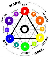
 Some of us may remember the basic color wheel from art classes in school. It has 12 colors laid out in a sort of rainbow pattern in a circle. Now the secret to the color wheel is quite simple - you can make all the 12 colors from just 3 basic colors!
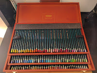
In fact, you can create all the colors in your pencils or pens just by mixing 3 colors along with the 3 neutrals - white, black and grey. Some art teachers recommend starting with just a handful of pencils, mixing your own colors to learn more about them.
Yellow, blue and red are the primary colors on the color wheel. When you mix 2 primary colors, you get a secondary color like orange, green and violet. You get tertiary colors by mixing a primary color with a secondary color. There are 6 tertiary colors giving us a total of 12 on the wheel.
Warm colors draw your eye to an object while cool colors are soothing. Warm colors appear to 'pop' off the page while cool colors can make objects recede into the background. Want to focus attention on something? Use red or yellow. Want to make a hill appear far away in the background? Use cool blues or greens.
The next time you're selecting colors, think of what you want to achieve. Pages with plenty of yellows and reds will look vibrant while those with blues and purples will soothe the eye. In the following posts, I'll talk more about color palettes/combos, why some colors work well together, why you get a muddy brown sometimes and how to select colors for a page.
But I think that they are kind of missing the point. I know I can get better at drawing if I practice every day. But real life doesn't give me much time for creative pursuits. Why shouldn't I enjoy playing with color just because I can't draw well?
Once I started coloring, I faced the biggest question for a newbie colorist - how do I pick colors for something? I loved looking at the finished pictures posted online by advanced colorists. I wanted to be able to create something like that! I learned some basics about colors and how they work to get better at coloring my books.
Before we dive into picking colors though, let's talk about color theory.
The Color Wheel
 Some of us may remember the basic color wheel from art classes in school. It has 12 colors laid out in a sort of rainbow pattern in a circle. Now the secret to the color wheel is quite simple - you can make all the 12 colors from just 3 basic colors!
In fact, you can create all the colors in your pencils or pens just by mixing 3 colors along with the 3 neutrals - white, black and grey. Some art teachers recommend starting with just a handful of pencils, mixing your own colors to learn more about them.
Yellow, blue and red are the primary colors on the color wheel. When you mix 2 primary colors, you get a secondary color like orange, green and violet. You get tertiary colors by mixing a primary color with a secondary color. There are 6 tertiary colors giving us a total of 12 on the wheel.
Warm vs Cool Colors
Colors are typically grouped into 'warm' or 'cool' categories. Warm colors are your yellows, oranges, and reds. Cool colors are your blues, greens, and purples. Just think of fire and water to remember what color goes where.Warm colors draw your eye to an object while cool colors are soothing. Warm colors appear to 'pop' off the page while cool colors can make objects recede into the background. Want to focus attention on something? Use red or yellow. Want to make a hill appear far away in the background? Use cool blues or greens.
Hues, Tints, Tones, and Shades... Oh My!
- Hue is the proper name for a color. So blue, red and yellow are all hues.
- Tints are a product of adding white to a hue.
- Shades are a product of adding black to a hue.
- Tones are a product of adding grey to a hue.
The next time you're selecting colors, think of what you want to achieve. Pages with plenty of yellows and reds will look vibrant while those with blues and purples will soothe the eye. In the following posts, I'll talk more about color palettes/combos, why some colors work well together, why you get a muddy brown sometimes and how to select colors for a page.

Comments