These are classic rules of thumb you can use to select colors for a page. There are two-color combos, three-color combos, and four-color combos. When you select a group of colors from these palates, you're almost guaranteed a good-looking finished product.
Two Color Schemes
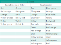
 When you want to select just two colors for a page, complementary and counterpoint colors are a good place to start. Complementary colors are those that are the opposite ends of the color wheel.
The counterpoint color is the one to the right of the complementary color. So green is the complementary color for red but the counterpoint would be blue-green which is one step to the right.
You can get vibrant looking pages with complementary colors but they have to be managed well. Counterpoint colors are a bit less dramatic than complementary color schemes.
Three Color Schemes
The three basic schemes in this group are analogous colors, triadic colors and split complementary colors. You can spread the three colors equally on the page or use 2 main colors with the third acting as an accent. Analogous colors are adjacent to each other on the color wheel. Simply select one color along with the two colors on either side of it. These colors are usually found in nature and work well together.
Triadic colors are evenly spaced around the color wheel. Triadic color schemes are vibrant and many artists referred to use one color as the dominant one with the other two acting as accents.
The split complementary is a variation on the basic complementary color scheme. Instead of selecting the opposite color, pick the colors on either side of the complementary. Instead of red and green, you would use red with blue-green and yellow-green. Split complementary color schemes are great for beginners.
Four Color Schemes
 Four-color schemes come in the form of squares or rectangles on the color wheel. Square color schemes are basically four colors that are evenly spaced from each other. You can select one color to be dominant or two. The rest will be accent colors.
Rectangle color schemes are pairs of complementary colors such as red-green and yellow-violet together. This color scheme will always contain a combination of warm and cool colors so you can use them to highlight certain objects on the page.
These are the basic techniques of combining various colors on the color wheel. Using a combination of colors that complement each other can be used to create more unusual landscapes or for fantasy type images.
Sometimes you finish the page only to find that certain colors don't work well together or that a few parts of the picture are more vibrant than others. Keep these color harmonies in mind when you select colors and you'll get better results.

Comments